|
Further presentation and analysis of data |
|
|
|
To use the resources of this chapter you must first register |
|
|
CONTENTS |
|
|
|
|
|
Once you have registered, you can work through the slides one by one.
The workout comprises a series of sides that guide you systematically through the topic concept by concept, skill by skill. The slides may be used with or without the support of a tutor. The methodology is based on problem-solving that advances in logical succession by concept and difficulty. The student is presented with a problem or series of questions, and the next slide presents the fully-worked solution. To use the material you must sign-in or create an account.
blacksacademy.net comprises a complete course in mathematics with resources that are comprehensive.
|
|
|
|
SAMPLE FROM THE WORKOUT |
| Showing American English version |
SLIDE 1 - QUESTION 1 |
 |
|
SLIDE 2 - SOLUTION |
 |
|
|
SAMPLE FROM THE LIBRARY |
| Showing American English version |
QUESTION [difficulty 0.1] |
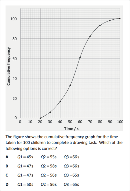 |
|
SOLUTION |
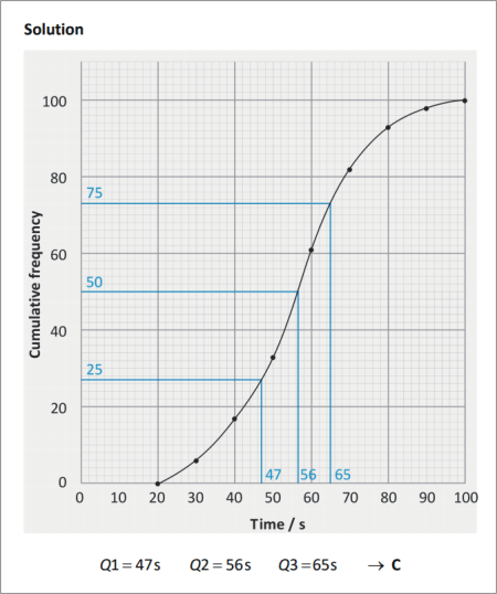 |
|
|
DEPENDENCIES |
|
|
|
|
CONCEPTS |
|
|
|
|
LEV. |
|
|
Consolidation of cumulative frequency and box plot
|
|
742.1 |
|
|
Comparison and interpretation of box plots
|
|
743.4 |
|
|
Continous data, frequency tables and interval width
|
|
743.8 |
|
|
Frequency is proportional to area in a histogram
|
|
744.4 |
|
|
Frequency density
|
|
744.7 |
|
|
Frequency density = freqency / class width
|
|
744.7 |
|
|
Consolidation of skew of data
|
|
745.0 |
|
|
Estimation
|
|
745.3 |
|
|
Rank order
|
|
745.3 |
|
|
Linear interpolation
|
|
745.3 |
|
|
Method of linear interpolation
|
|
745.5 |
|
|
Problem on area of rectangle in a histogram
|
|
745.7 |
|
|
|
|
RAW CONTENT OF THE WORKOUT |
|
| To make use of this chapter, please first register. Then you can work through the slides one by one. |
|
| What is provided here is the raw text of the workout. Most of the information is contained in the image files, which are not included with this text. The text may appear deceptively short. (The content overall of blacksacademy.net is vast.) Any in-line questions appear as a question mark [?]. This text is provided only as an indication of the overall quantity of material contained in the chapter. To use the material you must sign-in or create an account. |
|
| * |
|
|
Analysis of data
SLIDE 1
Consolidation - cumulative frequency and the box plot
The table shows information about the distance in metres of the houses of 100 children attending a primary school.
Distance / m Frequency Interval Cumulative frequency
6
6
11
16
28
21
11
5
2
Complete the table.
SLIDE 2
Distances of houses of children from a primary school
Distance / m Frequency Interval Cumulative frequency
6
6
11
17
16
33
28
61
21
82
11
93
5
98
2
100
SLIDE 3
Interval
/ m Cumulative frequency Interval
/ m Cumulative frequency
6
82
17
93
33
98
61
100
Plot the distance against the cumulative frequency.
SLIDE 4
Find Q1, Q2 and Q3.
SLIDE 5
SLIDE 6
Distances of houses of children from a primary school
distance / m
Lowest 45, 60
Q1 265
Q2 362
Q3 424
Highest 655, 685, 710, 735
Revision
The lower fence is either or the least data value, if this value lies within the inter-quartile range. The upper fence is either or the greatest data value. An outlier is any data value not lying within the lower and upper fence.
? Find the lower and upper fences for the data.
? Are any of the data values outliers?
SLIDE 7
Distances of houses of children from a primary school
distance / m
Lowest 45, 60
Q1 265
Q2 362
Q3 424
Highest 655, 685, 710, 735
SLIDE 8
Distances of houses of children from a primary school
distance / m
Lower fence 26.5
Q1 265
Q2 362
Q3 424
Upper fence 662.5
Outliers 685, 710, 735
Draw a box plot representing the data
SLIDE 9
Distances of houses of children from a primary school
distance / m
Lower fence 26.5
Q1 265
Q2 362
Q3 424
Upper fence 238.5
Outliers 685, 710, 735
SLIDE 10
Describe the skew of the data. Describe what this skew means in words.
SLIDE 11
Distances of houses of children from a primary school
The data exhibits negative skew. The tail of the distribution is elongated towards the smaller values of the distance. The spread (values) of distances below the median is larger than the spread (variance) of distances above the median.
SLIDE 12
Distances of houses of children from a primary school (2)
A box plot for a second primary school is shown above. Complete the table.
distance / cm
Lower fence 110
Q1 610
Q2 790
Q3 1070
690
Upper fence 1760
Outliers 1800
? Describe the skew of the data.
? What is the least distance of a child’s house from this primary school? Justify your answer.
SLIDE 13
Distances of houses of children from a primary school (2)
distance / cm
Lower fence 110
Q1 610
Q2 790
Q3 1070
460
Upper fence 1760
Outliers 1800
The data exhibits a positive skew. The interquartile range is 460 m. Since , the lowest fence is the least data value. So, the child living closest to the school is represented by the lowest fence, and lives 110 m away.
SLIDE 14
Distances of houses of children from a primary school (1)
Distances of houses of children from a primary school (2)
One of the schools is a small primary school in a densely populated city. The other school is a similarly sized primary school in a small market town. Which school is which? Justify your answer.
SLIDE 15
Distances of houses of children from a primary school (1)
Distances of houses of children from a primary school (2)
The scale of both box plots differs, and the median value for school (2) is 790 m in contrast to the median value for school (1) of 362 m, almost twice the distance. Primary school (1) is likely to be the school from the densely populated city area, because more people live within a given area, and hence children are likely to live closer to the school they attend.
SLIDE 16
Continuous data
? What is the distinction between continuous and discrete data? Given an example illustrating the difference.
? What is the difference between a bar chart and a histogram, and when do you use the one rather than the other?
SLIDE 17
? Data that is discrete can be counted by integers. Continuous data is data that can be measured by real numbers. Number of people at football matches ? discrete. Height of mountains ? continuous.
?
In a bar chart the columns are separated by gaps. In a histogram, there are no gaps, and measurements apart at the boundaries of the columns. Discrete data ? Bar chart. Continuous data ? Histogram.
SLIDE 18
Continuous data and frequency tables
? ?
Interval / m Frequency Interval / m Frequency
6
6
11
11
… … … …
? The above shows the beginning of two frequency tables presenting data. There is only one difference between the two tables – what is it?
? State the width of the intervals used in both tables.
SLIDE 19
SOLUTION AND EXPLANATION
Interval width in a frequency table
? ?
Interval
/ m Interval width / m f Interval
/ m Interval width / m f
10 6
9.5 6
10 11
10 11
… … … …
? The two tables differ in the way the interval is presented. In the first the boundaries are exact; in the second, the boundaries are given to the nearest integer value.
? The interval width in the first table is , but in the second, because of the way the interval has been written, the interval width varies.
stated interval actual interval interval width
For example, a value of 9.8 would not fall within the interval , because 9.8 rounds up to 10.
It is a favourite trick of examiners to present continuous data using discrete boundaries. The student is expected to interpret the intervals correctly.
SLIDE 20
? ?
Interval Interval width f Interval Actual
interval Interval width f
3
3
7
7
20
20
Complete the tables. What do you observe about the interval width in both cases, as we proceed down the frequency table? Why might a frequency table be presented in this way?
SLIDE 21
SOLUTION AND EXPLANATION
Variable class width
Interval Interval width f Interval Actual
interval Interval width f
15 3
14.5 3
10 7
10.0 7
5 20
5.0 20
The interval widths in both cases are not the same value. A variable interval width is used.
Data is presented in this way because there are more data values around the mid-value (mean or median) than there are in the tails. Because data tends to cluster in the middle region, intervals of different width may be presented.
Note. The width of an interval is also called the class width.
SLIDE 22
Mass of individual strawberries
Interval / g f
4
9
22
38
17
10
A student draws the following histogram.
Why is the presentation of the data in this way misleading?
SLIDE 23
Mass of individual strawberries
Interval / g f
4
9
22
38
17
10
This histogram is misleading because it creates the impression that there were more seeds in the tails of the distribution than really was the case. The areas of the intervals representing the tails are far too large.
SLIDE 24
Representation of continuous data in a histogram
When intervals are of variable width
frequency is proportional to the area of the rectangle
SLIDE 25
Mass of individual strawberries
Interval / g f
4
9
22
38
17
10
? In this histogram to what is the frequency proportional?
? How must the diagram be changed to rectify the problem that it is misleading?
SLIDE 26
SOLUTION AND EXPLANATION
Mass of individual strawberries
Interval / g f
4
9
22
38
17
10
? In the above diagram, frequency is proportional to the height of the rectangle.
? This is misleading, the frequency must be proportional to the area of the rectangle.
SLIDE 27
Frequency density
When intervals are of variable width frequency is proportional to the area of the rectangle
Mass of individual strawberries
Interval / g f Class width Frequency
density
4 15 0.27
9
22
38
17
10
Complete the above table. In the first row
SLIDE 28
SOLUTION AND EXPLANATION
Interval / g f Class width Frequency
density
4 15 0.27
9 10 0.90
22 5 4.4
38 5 7.6
17 10 1.7
10 25 0.4
Draw a histogram to represent this data.
SLIDE 29
SOLUTION AND EXPLANATION
Interval / g f Class width Frequency
density
4 15 0.27
9 10 0.90
22 5 4.4
38 5 7.6
17 10 1.7
10 25 0.4
SLIDE 30
Revision – skew
SLIDE 31
The table shows the ages of footballers playing in a professional league.
Age / years Frequency Class width Frequency
density
15
38
86
152
72
40
6
Complete the table and draw a histogram. Describe the skew of the data.
SLIDE 32
Age / years Frequency Class width Frequency
density
15 4 3.75
38 2 19
86 2 43
152 2 76
72 4 18
40 10 4
6 6 1
The skew of the data is positive.
SLIDE 33
Estimation
Age / years Frequency
15
38
86
152
72
40
6
Ages of footballers playing in a professional league
Above is a grouped frequency table for the age of footballers in a football league. In the table, the original data of the age of the footballers has been grouped into classes. The first class is . So, the table does not provide exact information about the age of those footballers – all we know is that 15 of them belong to that class.
By assuming that the actual ages, when put in rank order, are evenly spaced out in any given class, we can estimate the age of, say, the 10th value in rank order. The method that assumes that the age increases linearly with rank is called linear interpolation.
SLIDE 34
Age / years Frequency Cum f
15 15
38 53
86 139
152 291
72 362
40 403
6 409
By linear interpolation to estimate the median age of the footballers to the nearest month.
There are 409 footballers in the table. The median value is the 205th footballer in rank order by age. This footballer belongs to the class . Assume that the 139th value is 24 and the 291th value is 26. Then, by using a linear relationship (straight-line), we find by similar triangles.
SLIDE 35
A survey was made of the hourly wage of electricians.
Hourly wage
/ Ł Class width Frequency
density Frequency
Complete the table. ? Find the total number of electricians participating in the survey. ? Estimate the mean and median.
SLIDE 36
Hourly wage
/ Ł x Class width Frequency
density f xf
9 8 2.5 20 180
19 2 7.5 30 570
22 4 6.0 24 528
37 26 0.5 13 481
Totals 87 1759
The total number is 87. The mean is .
The median is the 44th value. It lies in the class .
SLIDE 37
80 observations were made of a variable x. Each observation was made to the nearest whole number.
x
Frequency 30 18 32
A histogram was drawn so that the rectangle representing the class had a width of 2 cm and a height of 5 cm. What was the width and height of the rectangle representing the class?
SLIDE 38 – error in interval of last corrected – does not affect solution – CHECK THE SLIDE
80 observations were made of a variable x. Each observation was made to the nearest whole number.
x
Frequency 30 18 32
A histogram was drawn so that the rectangle representing the class had a width of 2 cm and a height of 5 cm. What was the width and height of the rectangle representing the class?
Solution
The width of the class is not but .
The width of the class is . So the width of the rectangle representing the class is half the width of the rectangle representing the ; this is 1 cm.
The area of the class is .
Since, frequency area,
The class has a frequency of 18 so requires an area of . The area of the class is . So, the height of this class is .
Thus, the rectangle for class, has width 1 cm, height 6 cm.
|
|

